Note: These web pages offer the FIRST edition of the global warming primer for you to read freely. The NEW second edition (published 2024) is currently available only in book form (print $18; e-book $8). More details here.
“I will simply try to clarify what the debate over climate change is really about. It most certainly is not about whether climate is changing: it always is. It is not about whether CO2 is increasing: it clearly is. It is not about whether the increase in CO2, by itself, will lead to some warming: it should. The debate is simply over the matter of how much warming the increase in CO2 can lead to, and the connection of such warming to the innumerable claimed catastrophes.”
— Richard Lindzen, Feb. 22, 2012 (speech to the British House of Commons)
Richard Lindzen is arguably the most prominent “skeptic” disputing the threat of global warming, primarily because he has strong scientific credentials as a professor at MIT. He has been called to testify before Congress many times, he has had numerous articles published in media outlets that argue against global warming concerns (such as the Wall Street Journal editorial pages), and he speaks frequently to groups that oppose action on global warming. And yet, as you can see from his quote above, even he does not dispute the basic scientific case that we discussed in chapter 1. He disputes only the magnitude of the threat.
In other words, while there is no doubt that global warming is real, there is some legitimate debate about how serious a problem it is. This is where you may have heard about the “scientific consensus” on global warming — namely, that the vast majority of scientists who have studied the issue have concluded that it is a serious threat to our future that therefore demands serious and immediate action. Still, it’s only fair to acknowledge that it’s possible that Lindzen and other skeptics could be right when they claim that the threat of global warming has been overblown. In this chapter, I’ll explain the four major points of debate that have been raised by the skeptics, and we’ll examine what the evidence says in each case.
Skeptic Claim 1: Earth Is Not Warming Up
as Expected
The first skeptic claim we sometimes hear about global warming is that despite what I’ve told you about the simplicity of the 1-2-3 science, Earth is not actually warming up the way that logic predicts. To test this claim, we simply need to look at the evidence.
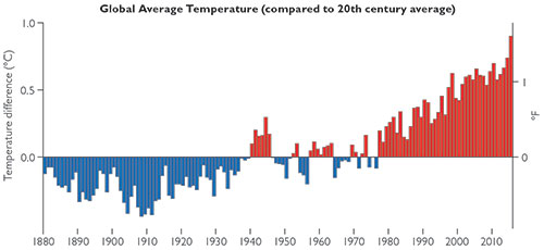
To determine whether Earth is actually warming up, scientists need to track changes in Earth’s global average temperature over time. Direct measurements from which we can infer global temperature go back to about 1880, though there are greater uncertainties for the earlier years. Figure 2.1 shows the data. Notice the clear upward trend — for an overall gain of at least about 0.85°C, or 1.5°F, over the past century — which confirms that our world is indeed warming, just as our 1-2-3 logic told us to expect.
Figure 2.1 This graph shows how global average temperature varied from 1880 through 2015. The horizontal line (for 0°) represents the average temperature for the entire 20th century. Notice the clear warming trend of recent decades. Source: National Climate Data Center (NOAA)Yes, but only thanks to some very careful work. Measuring Earth’s global average temperature essentially requires scientists to average local temperature measurements from many places around Earth, and this is not easy to do. For example, three fairly obvious complexities are: (1) even today, there are large regions of our planet (including the oceans and regions near the poles) for which we have relatively few temperature measurements, making it difficult to come up with a fully global average; (2) this problem becomes worse as we look to the past, when there were fewer weather stations; and (3) many measurements are made in or near urban areas, which tend to produce higher temperatures than they would if the same regions were rural or unpopulated, because urban areas generate their own heat through such means as the absorption of sunlight by pavement and the heat emitted from cars and homes (the “urban heat island effect”).
Because of these and other difficulties, there’s always some uncertainty in Earth’s precise global average temperature. In fact, the estimate of 15°C that I gave earlier (see figure 1.3) could be off by as much as a degree or two. That is why figure 2.1 shows only temperature differences (scientists often call them “anomalies”) from year to year, rather than actual values. To understand how this helps, imagine weighing yourself every day on two different scales, one of which always gives you a lower weight than the other. You may not have any way to know which scale is showing your true weight, but if you actually lose five pounds in a week, both scales will probably show the same five-pound loss. In much the same way, year-to-year differences measured by weather stations are much more reliable than their exact temperature readings. Therefore, by averaging year-to-year differences measured at weather stations around the world, scientists can get a reliable record of how Earth’s temperature is changing, even without knowing the “true” average temperature. Moreover, for recent decades, scientists also have data from satellites1, which in effect can take measurements from all around the world, including the regions where no weather stations are located.
That said, it’s still not easy. For example, the numbers and locations of weather stations change over time, the heat in cities can change as they grow, and different satellites collect data in different ways. Scientists must be very careful to take these factors into account when computing the change in temperature from one year to the next. Fortunately, several different scientific groups analyze both ground and satellite temperature data, each using somewhat different techniquesWeb page.">2. The results found by these different groups are all in close agreement, giving scientists great confidence that the trend shown in figure 2.1 is real. Indeed, while there is some debate over the size of the uncertainties in the data, there is no serious controversy over the general trends, which show that the world has been getting warmer over the past century.
Finally, it’s worth noting that the warming trend shown in figure 2.1 probably underestimates the true change. The reason is that polar regions are underrepresented in the data (because they have relatively few weather stations), and the available data show clearly that these regions are warming more than others. Therefore, if we had as many weather stations in polar regions as we do in other places, the data would probably show even greater warming.
Scientists generally state measurement uncertainty (often referred to as a “margin of error”) in terms of some level of confidence, and the most common level used is “95 chance that the true value is between 0.7°C and 0.9°C. Note that these uncertainty statements are not mere guesswork; they are based on careful analysis of the data and the potential sources of error in the measurements. Of course, careful analysis is hard, and for this reason different groups may not always agree on either the “best value” of a measurement or the precise uncertainty range. Still, as I’ve already noted, different groups analyzing the temperature data have found results that are all in close agreement. As you might expect, the uncertainties are greater for times further in the past (when there were fewer weather stations and no satellite measurements). Overall they are approximately as follows:3
For the early years in figure 2.1 (e.g., 1880–1900), the uncertainty in the measurements (with 95 confidence) was likely between –0.3°C and –0.1°C.
The uncertainty becomes smaller as time goes on, and for recent decades (since about 1980) is down to about 0.03°C. For example, the bar for 2015 shows a value of 0.90°C, so the true value (with 95% confidence) was likely between 0.87°C and 0.93°C.
For the overall warming trend of 0.85°C since 1880, the uncertainty is about 0.2°C, so the total warming (with 95% confidence) has probably been between 0.65°C and 1.05°C.
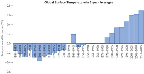
Figure 2.2 This graph shows the temperature data from figure 2.1 grouped into five-year averages. Notice that while there was some slowing of the rate of increase in the past 15 years, every five-year period since 1980 has set a new record.Perhaps the favorite claim of the skeptics in recent years has been that global warming has “stopped” (or “paused”) since the late 1990s. But this claim is demonstrably false. We expect temperatures and the climate system to have some natural variability, and this is apparent if you look at the year-to-year changes. Therefore, if you want to understand long-term trends, you have to look at averages over periods of multiple years. In figure 2.2, I’ve replaced the year-by-year data from figure 2.1 with the average (mean) for each five-year period. Notice that while there has been some slowing of the upward trend since the late 1990s, the trend remains upward. Therefore, global warming has not stopped. Indeed, as you can see, every five-year period since 1980 has set a new record for the hottest (since 1880). The most recent five-year period (2011–2015) is no exception, and if you look back at figure 2.1, you’ll also see that 2014 and 2015 set back-to-back one-year records, with 2015 shattering the prior record by a large margin. We don’t expect every coming year to set a new record, but the evidence clearly shows an ongoing warming trend, and the basic science tells us to expect this general trend to continue in the future.
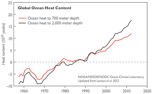
Figure 2.3 This graph shows how the measured heat content of the oceans has changed in recent decades; the data are plotted as five-year moving averages. Notice that there has been no slowing of the rise in ocean heat content, and in recent years more of the heat has been appearing in deeper waters. Source: NOAA, www.nodc.noaa.gov/OC5/3M_HEAT_CONTENT/Yes, there should be, and while scientists are still trying to understand the details, the basic explanation almost certainly goes as follows. The additional heat and energy trapped in the atmosphere by the rising carbon dioxide concentration can manifest itself in several different ways, and the rising surface temperature shown in figures 2.1 and 2.2 is only one of those. In fact, more than 90% of the added heat and energy is expected to warm the water in the oceans (as opposed to warming the land and ocean surface), and data indicate that the ocean waters have continued to warm without any evidence of slowing (figure 2.3). Indeed, a recent study (P. J. Gleckler et al., Nature Climate Change [Jan. 18, 2016]) indicates that the warming of the ocean water accelerated during the same period in which the surface warming slowed. Another area where the additional heat and energy can show up is in glacial melting, and there is similarly no sign of a slowdown in this melting. In other words, the most likely explanation for the slowing of the temperature increase since the late 1990s is simply that more of the added heat was deposited to the oceans and glacial melting during this period than during other periods.
If you are wondering why the heat would be deposited in different ways at different times, this is actually expected as a result of natural factors in the climate. For example, you’ve probably heard of the weather phenomenon known as “El Niño,” which has numerous effects but is most noticeable as a warming of the eastern Pacific Ocean. El Niño events occur naturally and typically last about a year, but their precise length can vary significantly, and they recur at irregular intervals and at varying strengths. Because El Niño events affect the entire Earth, they can change the way heat is deposited.b1o80C3%B1o-index' target='_blank' rel="noopener">here.">4 The same is true of other natural processes in Earth’s climate.
It’s also worth noting that if you look carefully at figure 2.1, you’ll see that 1998 was an exceptionally warm year compared to the years on either side of it. Indeed, if you were to remove 1998 from the data set, the “slowing” of the temperature rise since the 1990s would be much less pronounced. Why was 1998 so warm? It was a strong El Niño year; in fact, it came during the strongest El Niño in decades — though a similarly strong one is under way as I write in early 2016, and may explain why 2015 broke the previous one-year temperature record by such a large margin.
Bottom line: Global warming has not stopped, and while the rate of increase in the surface temperature has slowed since the late 1990s, this slowing is probably a temporary phenomenon in which more heat has been going into the oceans and glacial melting, leaving less heat going into the atmosphere. We can therefore anticipate that the upward trend in surface temperatures will continue, and if the heat absorption by the oceans slows, then the surface temperature increase will likely accelerate.
A 2015 paper published in Science magazine (T. R. Karl et al., Science 348, no. 6242 [June 26, 2015]: 1469–1472) has suggested that the actual rise in temperatures has been greater for recent years than that shown in figure 2.1. As I write this in early 2016, scientists are still debating whether this new claim is correct. I cannot claim any particular expertise on this issue, but based on discussions I’ve had with colleagues, I think that most scientists still assume the slow down was real. Either way, note that this claim would not in any way undercut the evidence of warming; if it is correct, it means the warming has been even greater in recent years than what I have shown you already.
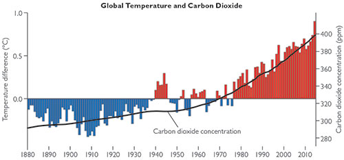
Figure 2.4 This graph repeats the temperature data from figure 2.1, with an overlay showing the carbon dioxide concentration (as an average for each year, so as to avoid seeing the seasonal wiggles shown in figure 1.8). The two are clearly moving in tandem for recent decades, lending support to the simplicity of our 1-2-3 logic for global warming.Yes. Our 1-2-3 logic suggests that the observed warming and the rising carbon dioxide concentration ought to be moving hand in hand, at least in a general sense. Figure 2.4 shows that this is indeed the case.
A couple of decades ago, there were still enough uncertainties in the temperature measurements that some scientists wondered if the warming trend was real. For that reason, a great deal of effort was put into understanding the uncertainties, and while some still exist (as we’ve discussed), there is no longer any serious debate about the trend.
In fact, the only people who still question the general warming are those, including a few prominent media pundits and politicians, who claim that the entire issue of global warming is some kind of hoax. But the evidence we’ve discussed is the product of work by thousands of scientists who have dedicated their lives to obtaining accurate and reliable data, and who have carefully examined both the strengths and the weaknesses of the data. So unless you believe that these thousands of scientists from around the world are all coordinating some great conspiracy, there’s no reasonable doubt about the fact that our world is warming.
Skeptic Claim 2: It’s Warming Up, but It’s Natural
As we’ve discussed, there is no longer any serious scientific debate about the general warming trend. However, a few skeptics — including some with scientific training — have suggested that the warming may be occurring for natural reasons, rather than as a result of human activity. So let’s look at the evidence to see whether there is any possibility that natural factors rather than human activities are the cause of the observed warming trend.
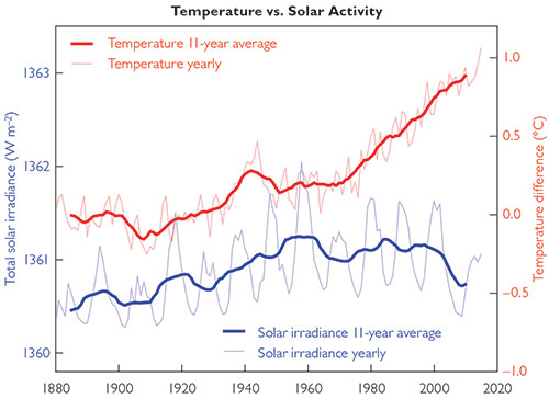
Figure 2.5 This graph compares changes in global average temperature since 1880 (essentially the same data shown in figure 2.1) to the amount of sunlight reaching Earth over the same period of time. Notice that, for recent decades, the amount of sunlight has moved in the opposite direction of the observed warming, which means the Sun cannot be the cause of recent global warming. Note: As you can see on the graph, the technical term for the amount of sunlight reaching Earth is solar irradiance, and it is measured in units of watts per square meter. Source: SkepticalScience.com.The Sun does indeed vary in its energy output from year to year, though by a very small amount (much less than 1%), which means small changes in the amount of sunlight reaching Earth over time. Moreover, we know that even relatively small changes in the amount of sunlight reaching Earth can affect the climate; as we’ll discuss shortly, such changes have probably been the triggers for cycles of past ice ages. But we can be very confident that changes in sunlight are not the cause of recent global warming, because of the data shown in figure 2.5. This figure compares changes in Earth’s temperature since 1880 (red curve) to changes in the amount of sunlight reaching Earth (blue curve). Notice that while the two trends matched up moderately well until about 1950, they have since gone in opposite directions. Clearly, we cannot blame an increase in temperature on a decrease in sunlight.
That is already pretty definitive, but there’s also a second reason we can rule out the Sun as the cause of the recent warming. If the Sun were responsible for global warming, we would expect the extra sunlight reaching Earth to warm the surface and the entire atmosphere more or less uniformly. In contrast, while the greenhouse effect warms Earth’s surface and lower atmosphere, it actually cools Earth’s upper atmosphere (that is, in the stratosphere and above).5 Observations show that the upper atmosphere is cooling, just as expected with a strengthening greenhouse effect, and the opposite of what we’d expect if global warming were being caused by the Sun.
In fact, several additional patterns of warming are also consistent with a strengthening greenhouse effect but not consistent with changes in the Sun.here.">6 For example, only greenhouse warming can account for measurements showing that nights have warmed more than days and winters (in both hemispheres) have warmed more than summers. Moreover, satellite measurements show that the total heat radiating into space from Earth has declined at the specific wavelengths radiated by carbon dioxide, which can only mean that this heat is being trapped by carbon dioxide molecules through the greenhouse effect.
Notice that each curve is actually two curves: a solid one showing the 11-year average and a ghosted one showing year-to-year data. Let’s start with the red temperature curves. The ghosted red curve represents the same data shown in figure 2.1, but as a line graph rather than a bar chart. The solid curve is what we call a moving average (or “running mean”) drawn through the first curve. That is, instead of showing temperatures for individual years, which vary quite a bit, each value on the solid curve represents the average for several years around it. This particular red curve shows each value as the average over 11 years, which means five years before and five years after each year for which it is plotted. (The solid curve stops before the end of the data set because we don’t yet have a full five years of “after” data for the most recent five years.)
The blue curves are similar. The ghosted curve shows actual year-to-year data, while the solid curve shows an 11-year moving average. One subtlety: For recent decades, the data on the amount of sunlight reaching Earth are based on actual measurements made by orbiting satellites. Earlier data are reconstructed based on historical observations of sunspots, which have been reliably recorded since long before the satellite era. The sunspot observations can be translated into solar irradiance because sunspot numbers correlate very well with the amount of sunlight.
That last subtlety explains why the graph uses 11-year averages: As you can see if you look closely at the ghosted blue curve, the number of sunspots on the Sun varies in an approximately 11-year cycle. Therefore, an 11-year moving average is the “fairest” way to show the data, because it effectively removes the variations due to the sunspot cycle so that we can see the underlying general trend.
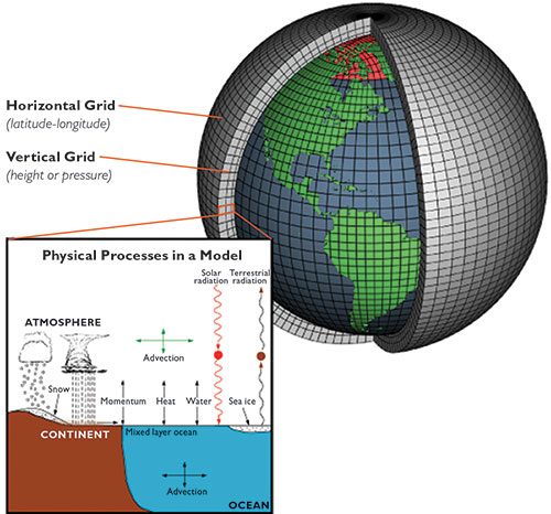
Figure 2.6 This illustration summarizes how a climate model works. A computer program represents Earth’s climate in a series of cubes. In each cube, scientists input data from some point in time to represent “initial conditions,” then “run” the model by using equations that represent the physical processes that can change the initial conditions. Source: NOAA.As we’ve just discussed, the pattern of warming is fully consistent with its being due to the addition of greenhouse gases through human activity. Still, Earth’s climate is very complex and affected by many factors, both human and natural, so it’s worth exploring whether there might be any other natural process that can explain the observed warming. The primary way that scientists investigate this possibility is by using what we call models of the climate.
Scientific models differ from the models you may be familiar with in everyday life, which are typically miniature representations of real objects, such as model cars or airplanes. In contrast, a scientific model is a conceptual representation, often developed with the help of computers, that uses known scientific laws, logic, and mathematics in an attempt to describe how some aspect of nature works. The model can be tested by seeing how well it corresponds to reality. Models are important in almost every field of science, but here we’ll focus specifically on models of Earth’s climate.
The principle behind a climate model is relatively simple. Scientists create a computer program that represents the climate as a grid of cubes like those shown in figure 2.6, so that each cube represents one small part of our planet over one range of altitudes in the atmosphere. The “initial conditions” for the model consist of a mathematical representation of the weather or climate within each cube at some moment in time. This representation might incorporate data on such things as the temperature, air pressure, wind speed and direction, and humidity at the time the model begins. The model uses equations of physics (for example, equations that describe how heat flows from one cube to neighboring cubes) to predict how the conditions in each cube will change in some time period, such as the next hour. It then uses the new conditions and the equations to predict the conditions after another hour, and so on. In this way, the model can simulate climate changes over any period of time.
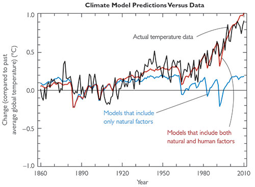
Decades ago, climate models were fairly simple, using grids no more complex than the one in figure 2.6. Over time, however, scientists have in essence used trial and error to make the models better and better. Again, the principle is easy to understand: If your model fails to reproduce the real climate in some important way, then you look to see what might be going wrong. For example, you might have neglected some important law of physics, or the cubes in your grid might need to be smaller to give accurate results. Once you think you know what went wrong, you revise the model, and see if it works better. If it does, then you have at least some reason to think you are on the right track, and if it doesn’t, you go back to the drawing board. Figure 2.7 This graph shows the excellent agreement between today’s climate models (red curve) and actual temperature changes (black curve), and the clear failure of models (blue curve) that take into account only natural factors in the climate. Conclusion: Today’s climate models work extremely well and demonstrate that global warming is caused by human factors such as the rising carbon dioxide concentration. Source: Intergovernmental Panel on Climate Change (IPCC). Note: Bloomberg Business created an outstanding set of graphics to show how the natural factors combine to make the blue curve, which you can see at www.bloomberg.com/graphics/ 2015-whats-warming-the-world/
Today’s climate models are fantastically detailed, and they reproduce the actual climate of the past century with remarkable accuracy. Indeed, the modern models work so well that scientists can use them to conduct “experiments” in which they ask what would happen if this or that were different than it is. Figure 2.7 shows an example of the power this approach provides. The red curve shows temperatures over the past century and a half as predicted by the best available climate models, which take into account both natural factors affecting climate, such as changes in the Sun’s output and volcanic eruptions, and human factors, such as the increase in the carbon dioxide concentration from the burning of fossil fuels. Notice that these models provide an excellent match to the general trends in the real data (black curve). In contrast, models that leave out the human factors predict the blue curve, and as you can see, this curve does not agree with the observed warming of the past few decades. The fact that we get a close match between the models and reality only when changes in both natural and human factors are included gives us great confidence that human factors are the cause of the recent warming.
It is not possible to create an exact representation of Earth’s climate (because it is too complex), so approximations must inevitably be used. Over the past few decades, numerous research groups around the world have made decisions about these approximations and developed their own climate models, each of them unique. While this might at first sound like a mess, it actually makes our confidence in modeling stronger, because despite their differences, all of these models now yield very similar results. We’d only expect this to be the case if all the models are successfully taking into account the most important climate factors. The model curves in figure 2.7 represent averages of results from several different individual models.
There are no known natural factors that could account for the substantial warming of the past century. We’ve discussed two sets of observations that definitively rule out the Sun as the cause: (1) solar energy input has been falling while the temperature has been rising; and (2) the upper atmosphere has been cooling while the lower atmosphere warms, which is consistent only with greenhouse warming, not warming due to the Sun. Scientists investigate other potential causes with models, and today’s sophisticated models match up extremely well with observations of the actual climate — but only when we include the human contributions to global warming, not natural factors alone. The match makes it highly likely that the models are on the right track, giving us further confidence in the idea that human activity is the cause of most or all recent global warming.
Skeptic Claim 3: It’s Warming Up, Humans Are Causing It, but It’s Nothing to Worry About
The evidence for human causation of climate change is now so strong that very few skeptics still dispute the idea of human-caused global warming. Instead, as Lindzen’s quote at the beginning of this chapter indicates, the more common skeptic claim is that the scientific consensus overestimates the level of danger posed by the warming. This claim tends to come in three major forms, each of which we’ll investigate here:
Skeptics point out that the climate has varied naturally in the past, and we are still here.
Skeptics claim the future warming will be less than most models predict.
A few skeptics suggest that warming may even be beneficial, rather than something to concern us.
Skeptic Claim 3, Part 1: Natural Climate Variability
There is no question that Earth’s climate varies naturally over time, and skeptics have seized on this fact in two major ways. Some have used it to argue that the current warming might simply be part of a natural cycle, but we’ve already discussed the fact that natural factors seem unable to explain this warming. A more legitimate debate is over whether the current warming is a danger, given what we know about past climate change. So let’s investigate.
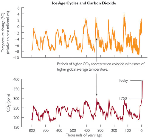
Figure 2.8 This graph shows changes in the temperature and carbon dioxide concentration over the past 800,000 years. Notice the close correlation, just as we expect from our basic 1-2-3 science. Source: Data from the European Project for Ice Coring in Antarctica.Earth has indeed cycled in and out of ice ages in the past, and we obviously did not cause any of these changes. We can study changes in Earth’s average temperature over the past 800,000 years with the very same ice cores used to measure past carbon dioxide concentrations (see figures 1.9 and 1.10). In brief, careful study of the layers in the ice cores allows scientists to make fairly precise estimates of the temperatures at the times the layers were laid down.this NASA Web page about ice core measurements.">7
Figure 2.8 shows the temperature record from the ice cores, along with the carbon dioxide record that we saw previously in figure 1.10. Notice that temperatures have fluctuated significantly over the past 800,000 years. The cool periods are ice ages, and the warm periods (known as “interglacials”) come in between them. Moreover, just as we expect from the basic science, the warm periods match up with higher carbon dioxide concentrations and the cool periods with lower carbon dioxide concentrations. This is further confirmation that our basic 1-2-3 science really is correct.
The skeptics point to these natural changes to suggest that the changes we are causing today are nothing to worry about. But consider these key points:
The current temperature is already approaching the highest it has been in the past 800,000 years. Given that the current carbon dioxide concentration is some 40% higher than at any other time in that period — and rising rapidly — it would seem that we should be very concerned about how much higher the temperature will rise.
Although the figure makes it look like the onset of warm and cool periods occurred fairly rapidly, when you consider that it shows 800,000 years, you’ll realize that “fairly rapidly” still means “over centuries.” In contrast, the changes we are causing today are happening over decades. Again returning to the chapter 1 opening quote by Margaret Thatcher, these changes are “new in the experience of the Earth.8
To summarize, while it’s true that the climate changes naturally, today we are causing changes of an unnatural degree at an unnatural rate. It’s hard to see how anyone could take any comfort from these facts.
The observed pattern of ice ages and warm periods lines up very well with a pattern of small, cyclical changes in Earth’s axis tilt and orbit that arise from gravitational effects of the Sun, Moon, and planets on Earth. These cyclical changes are called Milankovitch cycles, after a Serbian scientist who investigated their role in climate change. (Search on the name to learn more about these cycles.) But there’s a very important point that goes along with this: By themselves, the changes that would occur as a result of the Milankovitch cycles are not enough to explain the large temperature swings that occur. Instead, these cycles are “triggers” that initiate feedback processes that amplify the temperature changes.
Here’s how it is thought to work when a warm period begins: The changes due to the Milankovitch cycles slightly increase the amount of sunlight warming Earth and the oceans. This warming causes the oceans to release some of their dissolved carbon dioxide into the atmosphere. The extra carbon dioxide in the atmosphere causes additional warming, which in turn leads to more evaporation from the oceans. The added water vapor further amplifies the warming, because water vapor is also a greenhouse gas. To summarize, a small warming caused by the Milankovitch cycle initiates a chain of reinforcing feedbacks that lead to a much larger warming.
An opposite set of changes amplifies the cooling side of the Milankovitch cycles. When a cycle initiates a slight cooling, the cooling causes the oceans to absorb carbon dioxide from the atmosphere. This weakens the greenhouse effect, further cooling our planet and reducing evaporation from the oceans. The reduced evaporation means less water vapor in the atmosphere, amplifying the cooling until Earth plunges into an ice age.
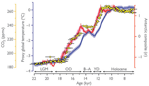
Figure 2.9 This graph shows a close examination of carbon dioxide concentration (yellow dots), Antarctic temperature (red curve), and global average temperature (blue curve) during the warming period that began about 20,000 years ago (“kyr” means “thousands of years”). Notice that while the Antarctic temperature changes come slightly ahead of the carbon dioxide changes, the global temperature changes do not. Source: J. D. Shakun et al., Nature 484 (Apr. 5, 2012): 49-54.It is true that in some cases, temperature changes measured in the ice core record appear to have preceded a rise in carbon dioxide, but this does not in any way change our understanding of the cause and effect. In fact, it’s completely consistent with the idea that, as discussed above, the Milankovitch cycles trigger small changes in climate that are then amplified by feedbacks with carbon dioxide and water vapor. In other words, the feedback processes mean that once the Milankovitch cycles initiate a temperature change, both the temperature and the carbon dioxide concentration will rise or fall together, and at any given moment or any given place on Earth, one or the other may change first.
Further evidence that the cause and effect are well understood comes from a closer look at data from the end of the last ice age. The details are beyond our scope in this book, but the brief summary is as follows. The ice cores that show a slight lead in temperature changes compared to the carbon dioxide changes come from Antarctica, which means they reflect the temperature changes that occurred over the Antarctic ice sheet. However, scientists have other ways to study past temperatures, such as by drilling into sediments in lakes or the ocean floor, and these make it possible to measure past temperature changes in many places around the world. This work is fairly difficult compared to ice core measurement, but figure 2.9 shows what scientists found for the end of the last ice age. The yellow dots show the carbon dioxide concentration, the red curve shows Antarctic temperatures, and the blue curve shows global average temperatures from other measurements. Notice that while the Antarctic temperature rise came very slightly ahead of the carbon dioxide rise (which, as stated above, is unsurprising), the global temperature rise came after the carbon dioxide rise — completely undercutting any claim that cause and effect are backward.here.">9
There are two questions here, so let’s start with the first: It’s true that the Vikings built settlements on the coast of Greenland beginning about a thousand years ago, during what is known as the Medieval Warm Period (roughly 950 to 1250 AD), when reduced Arctic sea ice made journeys to Greenland much easier than they were in the centuries before and after. But even at that time, Greenland was hardly “green”10 — the vast bulk of Greenland has been covered by an ice sheet for at least several hundred thousand years. The Viking colonization never occupied more than a few coastal regions.
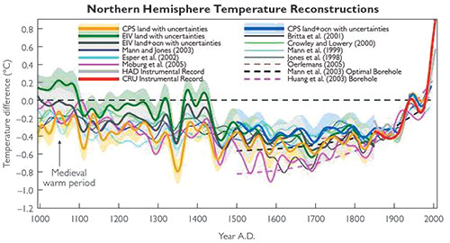
Now we turn to the second and more important question, which is whether the Medieval Warm Period is relevant to current global warming. The answer is a strong and definitive “no.” The reason is simple: Even though there was a Medieval Warm Period, the amount of warming at the time pales in comparison to the warming going on today. Figure 2.10 shows the data from numerous independent scientific studies (each in a different color), along with recent temperature data (red). Notice that while the different studies do not all agree perfectly for times further in the past, they do all agree that today’s temperatures are significantly higher than those of the Medieval Warm Period.
In fact, the evidence is even stronger than that shown in figure 2.10, because that figure shows only Northern Hemisphere temperatures. This is important because careful studies indicate that the Medieval Warm Period was a regional phenomenon that affected the northern Atlantic much more than other parts of the world; globally, there was little if any overall warming during this period. In other words, the Viking colonization of Greenland was made possible by regional, not global, climate changes. Today’s warming, in contrast, is truly global.
Figure 2.10 This graph shows more than a dozen different independent data sets all pointing to the same basic fact: Temperatures in recent years (solid red) have become significantly higher than they were during the Medieval Warm Period or any other time in the past 1,000 years. This graph is nicknamed the “hockey stick” because it looks kind of like a hockey stick lying on the ground with its tip pointing up at the right. Source: M. E. Mann et al., PNAS 105, no. 36 (2008): 13252–13257.Well, you probably have heard this, since it is frequently repeated in places like the Wall Street Journal’s op-ed pages, but it is not true. The original version of the “hockey stick” was published by climate scientist Michael Mann in 1998, and he used only a single data set. Skeptics jumped on it, claiming all kinds of reasons why the data should be doubted. Scientists took the skeptic concerns seriously, and therefore did what scientists do: They investigated in more detail. Indeed, the reason you see so many data sets — from independent sources including tree rings, corals, stalagmites, ice cores, and more — in figure 2.10 is that the scientific community went to great lengths in trying to either confirm or refute Mann’s original “hockey stick.” Keep in mind that every curve you see in figure 2.10 represents many years of fieldwork and careful research by a substantial group of scientists, who often put their lives on the line to collect the data in remote and dangerous locations. As you can see, these additional studies clearly confirm Mann’s original conclusions. Still not mollified, the skeptics were so adamant in their objections that they convinced Congress to ask the National Research Council (NRC) to investigate those conclusions. The NRC report, published in 2006, concluded that the graph and the data were fully valid. Additional research since that time has only further strengthened the case for the validity of the “hockey stick” and what it tells us about changes in global temperatures over the past 1,000 years. If you want to learn more about this issue, two great sources are the NRC report (which you can download free at www.nap.edu/catalog/11676/surface-temperature-reconstructions-for-the-last-2000-years) and Michael Mann’s book The Hockey Stick and the Climate Wars (Columbia University Press, 2012).
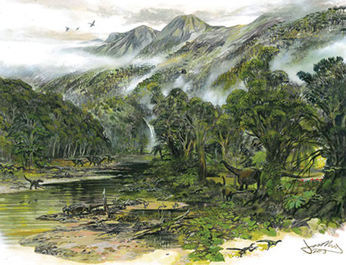
Figure 2.11 This painting shows Antarctica as it may have looked about 70 million years ago, when our planet was so warm that there were no polar caps and the carbon dioxide concentration was probably above 1,000 ppm. Source: Artwork by James McKay, University of Leeds, from V. Bowman et al., Palaeogeogr., Palaeoclimatol., Palaeoecol. 408 (Aug. 15, 2014): 26–47.Although it’s more difficult to figure out what the climate was like for times further in the past, evidence does indicate that there have been times when Earth was much warmer (and times when it was much colder) than anything we see in the 800,000-year record. For example, during much of the dinosaur period, evidence indicates that the global average temperature was significantly warmer than it is today, and the carbon dioxide concentration may have been above 1,000 parts per million, or more than double today’s just-passed-400 parts per million. But I do not find these facts the least bit comforting; quite the opposite, as they seem to me to suggest that current warming could be even more devastating than most scientists generally assume.
Let’s start by considering the implications of the warm temperatures of the age of the dinosaurs. These temperatures were high enough that there were no ice caps in either the Arctic or the Antarctic (figure 2.11), suggesting that a warming that brings back the temperatures of those times would cause the ice caps to melt completely. If that happened (a possibility we’ll discuss in more detail later), sea level would rise so much that every coastal city in the world — not to mention most of Florida, Texas, and other low-lying coastal regions — would be deep under water. (Indeed, sea level during portions of the dinosaur period was more than 200 feet higher than it is today.)
As to the carbon dioxide concentration of the distant past, I’ll make two points. First, you may hear skeptics claim that the fact that life thrived when the carbon dioxide concentration was much higher than it is today is proof that life can thrive under such conditions. Well, it is — but it’s only proof for the species that were living at the time and therefore were adapted to those conditions. There is no reason at all to think that today’s plants and animals would thrive similarly, because today’s life is adapted to today’s much lower carbon dioxide levels. It’s far more likely that such a high concentration of carbon dioxide would cause severe damage to today’s ecosystems. Second, while a carbon dioxide concentration of 1,000 parts per million sounds very high compared to today’s 400, a look back at figure 1.10 shows that at the current rate of increase, we would surpass that level in just a few hundred years. Returning again to the quote by Margaret Thatcher, what we are doing to our planet today is unprecedented and “new in the experience of the Earth.”
Skeptic Claim 3, Part 2: The Reliability of Models
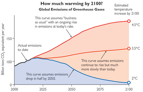
Figure 2.12 These three curves show three different possible scenarios for the rise or fall in human-caused emissions of carbon dioxide through 2100, and the numbers at the right show the temperature increase that models predict for each case. Notice that the “business as usual” curve leads to a global average warming of 4.5°C (8°F) by the end of this century. The middle curve shows what happens if emissions flatten out at about their current levels. Perhaps the most sobering is the blue curve, which shows that even if we reduce emissions to half of today’s amount by 2050 and much less by 2100, we still end up with a temperature rise of 2°C, or about 4°F. Source: www.climateinteractive.org/tools/scoreboard/A closely related claim holds that fears of global warming are overblown, because current models overestimate how the climate responds (the “climate sensitivity”) to changes in the carbon dioxide concentration and therefore also overestimate the future warming. For example, most models predict that under a “business as usual” scenario (meaning no significant reductions in our current carbon dioxide emissions), the temperature would rise by 4–5°C (7–9°F) by the end of this century (figure 2.12), but some skeptics have claimed the rise won’t be more than 2°C even in the worst case. In essence, they claim that the models overestimate climate sensitivity because they are missing key factors that might mitigate the future warming.
Could these skeptics be correct? The first thing that any scientist will tell you about modeling is that it’s not easy. As an old saying goes, “Prediction is hard, especially about the future.” But hard is not the same as impossible, and as we’ve discussed, today’s sophisticated climate models do a good job of “predicting” the climate that exists today (meaning that the models match reality quite well, as you saw in figure 2.7). We can therefore have some confidence that these models should be at least modestly reliable in predicting what will happen in the future.
Notice my choice of words: “modestly reliable.” The skeptics like to jump all over this type of honest assessment of the validity of models and essentially claim that we therefore shouldn’t rely on the models at all, particularly when they predict dire impacts from global warming. But that’s like saying that hard is impossible — it’s just not true. It is possible that the models will prove to be far off the mark, but we certainly wouldn’t expect that, based on how well they work for the present climate. So let’s look in a little more detail at the common skeptic claims about modeling and see why the vast majority of scientists find these claims unconvincing.
This question comes up frequently in the media, but it’s based on a misconception about the nature of weather and climate. The two terms have very different meanings:
Weather refers to the ever-varying combination of winds, clouds, temperature, and pressure that makes some days hotter or cooler, clearer or cloudier, or calmer or stormier than others.
Climate refers to the average of weather over many years. For example, we say that a desert has a dry climate, even though it may sometimes rain or snow.
It is always easier to make predictions about long-term averages than about short-term variations. For example, when 10,000 people go to a casino, we can’t predict the wins and losses for any single individual, but we know that on average, the gamblers are going to lose more than they win, which is how casinos make money. Similarly, we can’t say whether or when a particular smoker will get lung cancer, but we know that on average, lung cancer is much more common among smokers. The situation with weather and climate is exactly the same: It’s much more difficult to predict the short-term variability of weather than the long-term average that represents climate.
In other words, the fact that it’s hard to predict the weather is completely meaningless in considering whether we can predict the climate. The evidence that we can predict the climate comes from the fact that today’s sophisticated climate models do an excellent job of matching up with the present climate reality, giving us confidence that they should be similarly good at predicting the future climate.
It’s also worth noting that when I say that today’s models do an excellent job of matching reality, I mean much more than just the global average temperature. Today’s models make regional predictions, and these regional predictions also match up to reality quite well. For example, as we’ll discuss more in the next chapter, models have predicted numerous regional changes that appear to be occurring as expected, such as increases in drought in California, in storms along the East Coast, in flooding in regions of Asia, and much more. To ignore the insight provided to us by climate models simply does not make any sense.
It’s true that clouds are very complex and their effects are still not fully understood. This fact opens the way for a skeptic argument that basically goes like this: Global warming means the world starts getting warmer, and this increases evaporation from the oceans, which in turn means more clouds, which in turn reflect more sunlight, thereby stopping further warming. In other words, the claim is that clouds represent a negative feedback that acts to prevent global warming from getting too bad.
The problem with this argument is that it ignores two other effects. First, the additional evaporation that leads to the additional clouds also means there is more water vapor in the atmosphere, and recall that water vapor tends to amplify the effects of changes in the carbon dioxide concentration. While there is some legitimate debate over which effect — the extra heating from water vapor or the extra cooling from clouds — is stronger on relatively short time scales, there is little doubt about water vapor’s amplifying role over periods of decades or longer. Moreover, even for short time scales (years), current understanding of cloud physics has led most scientists to conclude that the heating effects are stronger than the cooling ones.
Second, clouds are not the only thing that matters here. What really counts is the total reflectivity of Earth: If the reflectivity increases, that tends to cool the planet, and if it decreases, it tends to warm it. And while clouds contribute to the total reflectivity, the surface also plays an important role, and global warming is causing the surface reflectivity to decrease, which tends to make the warming worse. The major reason for this decrease is the melting of ice, which is much more reflective than the water or ground cover that replaces it after it melts. For example, the fact that much of the Arctic ocean is now ice-free for much longer times each year than in the past means that this ocean reflects less sunlight (and therefore absorbs more), which leads to more heating.
Most climate scientists suspect that, together, the warming effects of added water vapor and reduced ice cover should overwhelm the cooling effects of additional clouds. So while you may still hear this argument raised on occasion, you should recognize that any claims that clouds will mitigate our problems are on very weak ground.
It’s certainly conceivable that the models could still be missing other factors that might mitigate future warming (and also possible that they are missing factors that might amplify it). However, if any such mitigating factors exist, they would have to have some rather strange properties. In particular, because they would by definition be factors that are not considered by current models, they would have to be both unimportant enough that they haven’t caused major failures in the model results through the present time and important enough to make a major impact on the model results for the future. We cannot completely rule out the possibility that such factors exist, but these odd properties make it seem rather unlikely. This is a major reason why the vast majority of scientists reject the skeptic claims and instead conclude that the threat of global warming is every bit as bad as the models suggest it to be.
OK, let’s say you want to ignore all the evidence from the models that I cited above and stick to the skeptic claim that, because the models can never be perfect, we shouldn’t trust them at all. Well, that’s not very scientific of you, but let’s go with it for the moment . . .
Whether or not you believe the models, you still have to make decisions about what, if anything, we should do about global warming for the future. If you don’t want to consider the models, then the only viable alternative is to base your decisions on the actual data. So let’s see what the data tell us. Look back at figure 2.8, where you can see how temperature and carbon dioxide have changed together in the past. Notice that:
Over the past 800,000 years, the largest upward swings in carbon dioxide concentration have been from about 180 to 290 parts per million, which is an increase of about 60%.
These 60% increases in carbon dioxide concentration have been accompanied by temperature increases of about 8°C to 10°C (14°F to 18°F).
Putting these two facts together, the past data seem to suggest that a 60 increase) of the carbon dioxide concentration well before the century ends. In other words, the projection you would make from actual past data is worse than what the models are suggesting.
As we’ve seen, if you are looking for a mitigating factor that might “save” us from the otherwise scary predictions about global warming, no such factor has been found, and the success of models to date makes it unlikely that any such factor exists. We cannot be certain that the model predictions are accurate, but we ignore them at our peril.
Skeptic Claim 3, Part 3: Benefits May Outweigh the Risks
Because there seems little way to deny the reality of global warming, some skeptics instead try to claim that this warming will be good for us and therefore that we do not need to do anything about it. This is a rather remarkable assertion, because these skeptics are essentially advocating that we continue doing an “experiment” on our planet without being sure of the consequences. It is especially surprising when you realize that many of the people taking this position claim to be great admirers of conservatives like Ronald Reagan and Margaret Thatcher, yet they are clearly violating Reagan’s dictate about the common sense of preserving (not dramatically changing) the environment (see quote that opens the introduction) and ignoring Thatcher’s warning that we are “changing the environment of our planet in damaging and dangerous ways.” Nevertheless, let’s take a brief look at a few of these recent claims that global warming will be beneficial.
One of the key “benefits” claimed for global warming is that the increased carbon dioxide concentration will increase plant growth, thereby helping agriculture. As I noted earlier, the skeptics making this claim often point to the thriving plants of dinosaur times, when carbon dioxide concentrations were far higher than they are today. But we’ve already seen how this argument falls apart. Plant and animal species adapt over time to the environments in which they live. The species that thrived in dinosaur times had millions of years to adapt to those conditions, while today’s plants and animals are adapted to today’s conditions.
Skeptics also point to small-scale experiments that have shown limited benefits for crops such as soybeans and rice with higher carbon dioxide concentrations. But they ignore the overall ecological effects that may be far more important. Remember that plants and animals are adapted to local climates. If the climate changes slowly, then species can adapt or migrate to survive. But if the climate changes faster than they can adapt or migrate, then they will die out or be replaced by other species. The rapid rate of climate change today therefore makes it likely that there will be great changes in the distribution of the plant and animal species living around the world, which means great changes to the entire ecosystem upon which our modern economy depends. While there may be a small chance that all these changes could actually prove beneficial, the vast majority of scientists suspect that the changes will be detrimental. You’d have to be an audacious gambler to be willing to continue on the path we are on in the small hope that it will turn out to be beneficial in the end.
The melting of Arctic sea ice is already causing a rush for Arctic riches, such as faster shipping routes among northern countries and access to minerals, oil, and other resources of the Arctic Ocean. By themselves, these things would seem to be beneficial to the global economy. But the key words are “by themselves,” because they don’t occur in isolation. Instead, they are consequences of having less sea ice, and that appears to be a very detrimental development on at least two levels.
First, as I’ve already noted, the fact that water is less reflective than ice means that Earth absorbs more heat from the Sun when Arctic ice melts, and this will only exacerbate the effects of global warming. Second, the distribution of ice in the Arctic has very significant effects on regional and global weather patterns, so we can expect major changes in atmospheric circulation and local weather as the Arctic melts. Already some scientists suspect that, through a complex set of interactions, the reduced amount of summer ice in the Arctic may be linked to the extreme winter weather that has affected the United States and Europe in recent years. While there’s great debate among scientists about whether this particular linkage is real, we should expect at least some significant weather consequences from changes in the amount of sea ice.
The bottom line is that the melting of Arctic ice essentially is yet another unprecedented “experiment” on our planet. While there’s always a small chance that this experiment will result in more pros than cons, it seems a highly dangerous experiment to conduct.
A few decades ago, some skeptics tried to claim global warming wasn’t real at all. As the evidence accumulated, they tried to claim it was a natural change rather than human caused. Now, recognizing that they can no longer legitimately dispute the human causation, they’ve turned to claims that global warming might not prove to be so terrible, or might even be beneficial to us. In every case, they’ve laid out arguments that other scientists have shot holes through, and in careful consideration of all the evidence, the vast majority of scientists have rejected the skeptic claims. Indeed, as has been widely reported, surveys have found that more than 97 value, as summarized here and published in J. Cook et al., Environ. Res. Lett. 11, no. 4 (April 13, 2016).">11
In response to this last fact, the skeptics like to point out that science is not a democracy, and scientific facts can’t be changed by a vote. But if you’re not a scientist, you still have to decide who to trust. Imagine that you visited 100 doctors, and 97 of them told you, “You need to eat less sugar,” while three said, “More sugar is good for you.” Which would you believe? I’ll let you answer that question for yourself, but note that you should give exactly the same answer to the question of who you should believe about the potential dangers of global warming.
Skeptic Claim 4: It’s Warming Up, Humans Are Causing It, It’s Harmful, But It’s Not Cost-Effective to Solve It
We’ve now addressed all the major skeptic claims that relate directly to the science. However, another group of skeptics takes a different tack. This group accepts that global warming is real, human caused, and serious — but argues that the costs of dealing with it are high enough that more good could be done by applying our efforts in other areas. The best-known advocate of this idea is the Danish writer Bjørn Lomborg, but similar ideas have been advanced by many others.
Because this claim is based more on economics than on science, it’s less of a clear-cut call. For example, as those behind these claims frequently remind us, the low-cost energy of fossil fuels has been a key to strengthening our modern economy and raising millions of people out of poverty. If we are going to move away from fuel sources that have had so many clear benefits in the past, we ought to have a really good reason. I think we do . . . but in order to make that decision, we need a clear understanding of the risks posed by global warming and the costs of alleviating those risks. We’ll turn to these issues in the next two chapters.
 Note: These web pages offer the FIRST edition of the global warming primer for you to read freely. The NEW second edition (published 2024) is currently available only in book form (print $18; e-book $8). More details here.